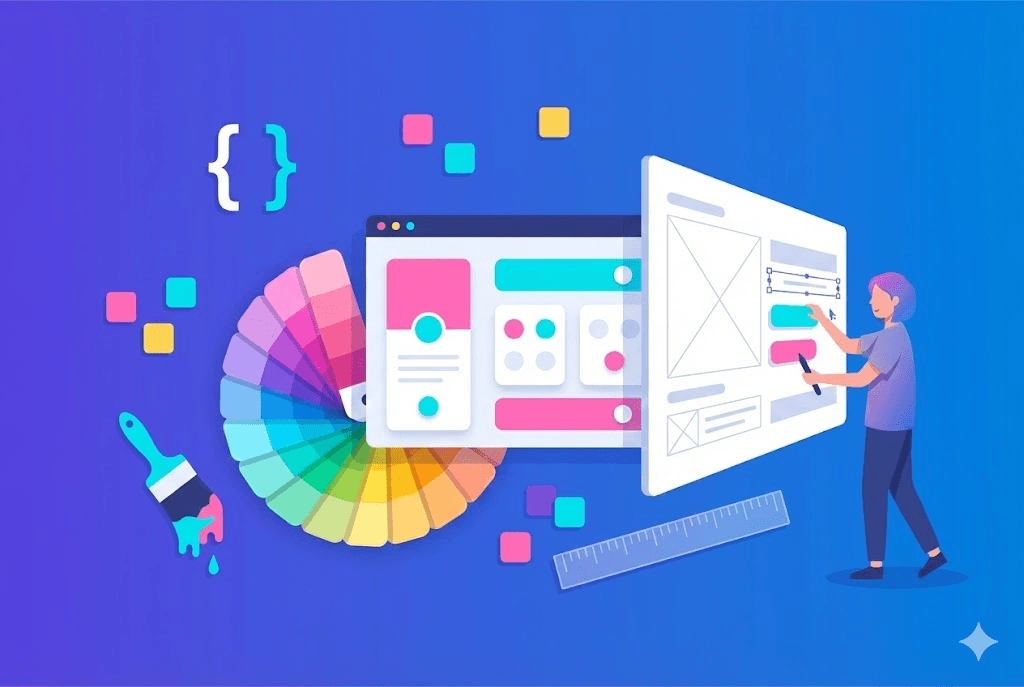
Modern Responsive Design
Responsive design is no longer optional. With over 60% of web traffic coming from mobile devices, your site must look perfect on any screen.
Prerequisites
- Knowledge of HTML and CSS
- Code editor configured
- Browser with developer tools
- Basic knowledge of Flexbox and Grid
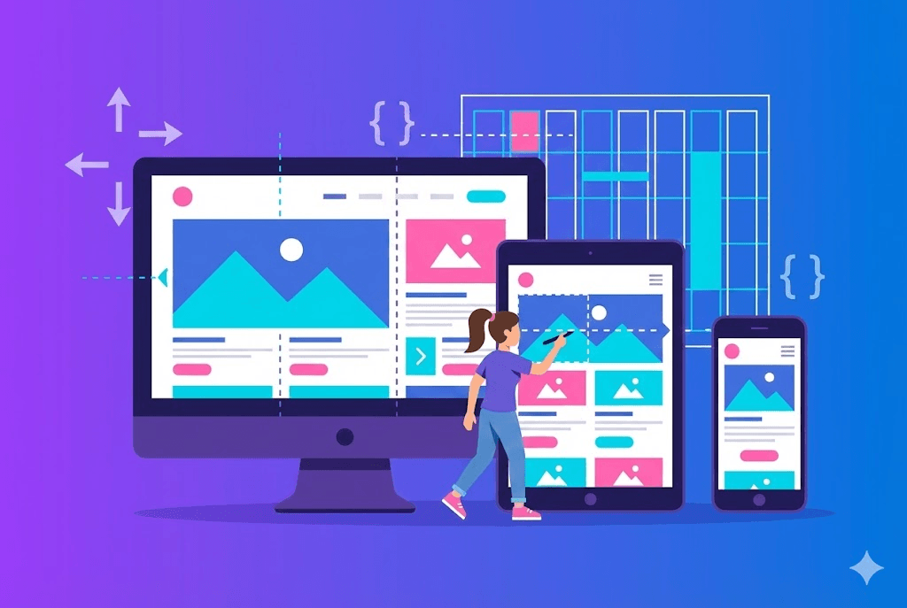
Mobile-First approach
The mobile-first approach means designing for small screens first and then expanding for larger screens. This results in cleaner CSS and better mobile performance.
Pro Tip
Breakpoints and Media Queries
Breakpoints define at which points your design changes layout. Use content-based breakpoints, not device-specific ones, for a truly responsive design.
- 640px (sm): Phones in landscape
- 768px (md): Tablets in portrait
- 1024px (lg): Tablets in landscape and laptops
- 1280px (xl): Desktops
- 1536px (2xl): Large screens
Conclusion
Responsive design is a fundamental skill for every web developer. Mastering mobile-first and breakpoints will allow you to create experiences that work perfectly on any device.
THE AUTHOR
Peter Lima
Peter is a full stack web developer with over 5 years of experience creating digital solutions. Specialist in React, Next.js and Node.js, passionate about sharing knowledge and helping other developers grow professionally.
More from Peter Lima